
[ad_1]
Some scenes from a movie stay with you forever. For me, it is the terrifying moment as the Titanic tilts vertical and sinks, Forrest Gump standing by his childhood tree through the years, a blue whale leaping out of a bioluminescent Pacific Ocean under the vast starry sky (Life of Pi). But sometimes, it is the setting that makes an impression: the eerie white floors in the mysterious room at the end of 2001: A Space Odyssey, the basement in Parasite, or the oh-so-comfortable warmth of a snug Hobbit hole.
We often underestimate the sheer planning that goes into film sets – with every item, colour and texture picked to not only fit with the time period shown but also the character’s profile. There are layers to the plot and characters that are housed in the interiors and come to life through mise-en-scene, which refers to the arrangement of the actors and sets before the audience.
Here, we go through our top picks of interior sets from iconic movies, with an in-depth look on each style, its meaning and some of our fave statement pieces!
1. Titanic – The luxury ocean liner
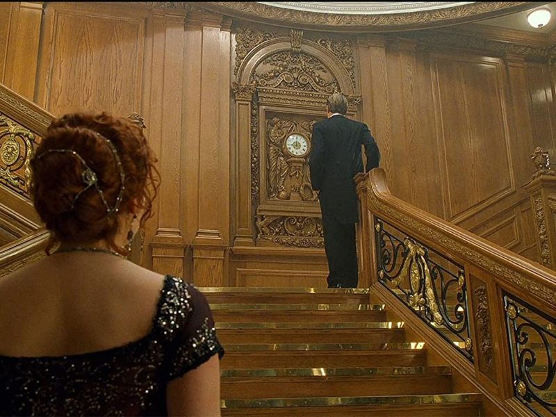
Image Credit: IMDb
Where do we even begin? The sets of this mammoth 200 million dollar undertaking by James Cameron inspires awe in viewers even now more than two decades later (spoken from experience, as I re-watched it a month ago and cried yet again). The giant luxury steamship was made in the exact likeness of the 1911 RMS Titanic that set out on its ill-fated journey and showcases a variety of ornate traditional interior styles at the time.
The grand staircase, a central set in the movie, featured wrought-iron banisters in the Louis XiV style and was made of oak in neoclassical William and Mary style, that includes intricate woodturning, high relief carving and strong contours. At the centre, a bronze cherub holds a torch, and behind it is a decorative timepiece with high-relief panels – a special place for the star-crossed lovers.
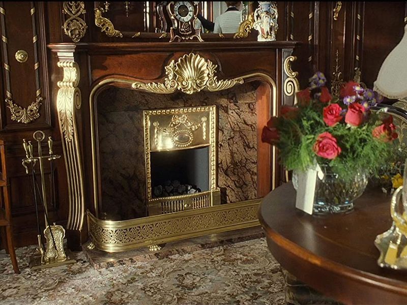
Image Credit: IMDb
Rose’s suite is plush, sophisticated and Victorian. Velvet wingback chairs and sofas, alabaster lamps are spread over thick carpets, and the room’s walls are of dark wood with gilded gold ornament dotted with wall sconces. It also features rich navy blue and gold damask wallpapers and a statement fireplace with an intricate gold mantelpiece. Cruises back in the day were certainly something else.
2. Parasite – Park family mansion
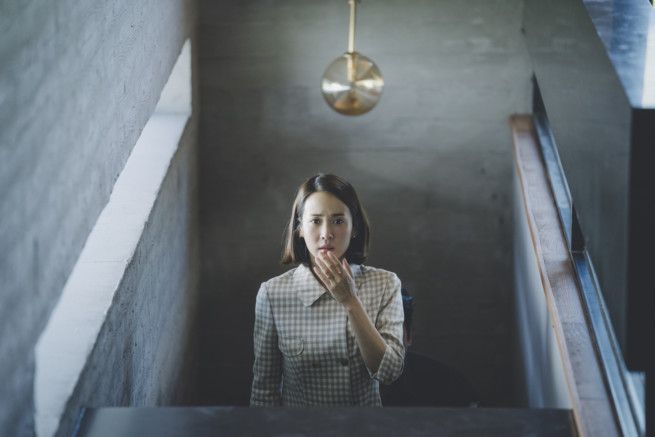
Image Credit: Neon via AP
One thing you would have felt on watching this genre-bending satire on capitalism, is that the house of the wealthy Park family is a character in itself. Built from scratch under the directives of production designer Lee Ha Jun, the impossibly sleek, dark wood paneled and grey-toned mansion is a picture in spare, modernist interiors. The design style encompasses homes with crisp lines, bare industrial materials such as metal, glass and steel, a simple colour palette and minimal décor.
The lines stand out from the beginning – from the shiplap decorative cladding on the outer fences, to the paneled dark wood slabs, sharp staircases and rigid outlines marking the vast glass windows that overlook the garden. There really is a sense of unforgiving rigidity in the space that underlines the movie’s message on class mobility and the lines often separating characters of different economic classes. The industrial look is expressed by the simple pendant lights with exposed bulbs (which is used for Morse Code by the basement inhabitant) and the glossy grey tiles, that transition to matte grey cement in the kitchen and wooden flooring in the living room.
The non-patterned, sleek and modular furniture is another characteristic of modernism, as the big sofa is actually four smaller single sofas with steel frames joined together. The kitchen features a bare minimal table design with the outline, open backed chairs on carpeted floors and a sleek steel lamp.
Finally, in lovely contrast – these spare lines of glass, concrete and wood are bathed in an abundance of natural light, courtesy of the wall to ceiling windows, an elongated window by the dining table, a clerestory window and even an entirely glass door leading out to the bright green garden. With good reason – in an interview with Indie Wire, Bong Joon Ho said, “The poorer you are, the less sunlight you have access to, and that’s just how it is in real life as well.” The wall sconces with warm lighting and a full accent wall of backlit displays of fine china (reminiscent of traditional-style interiors) add a warmth and opulent undertone to the grey mansion.
3. The Hobbit: An Unexpected Journey – Bag End
Style: Rustic and traditional
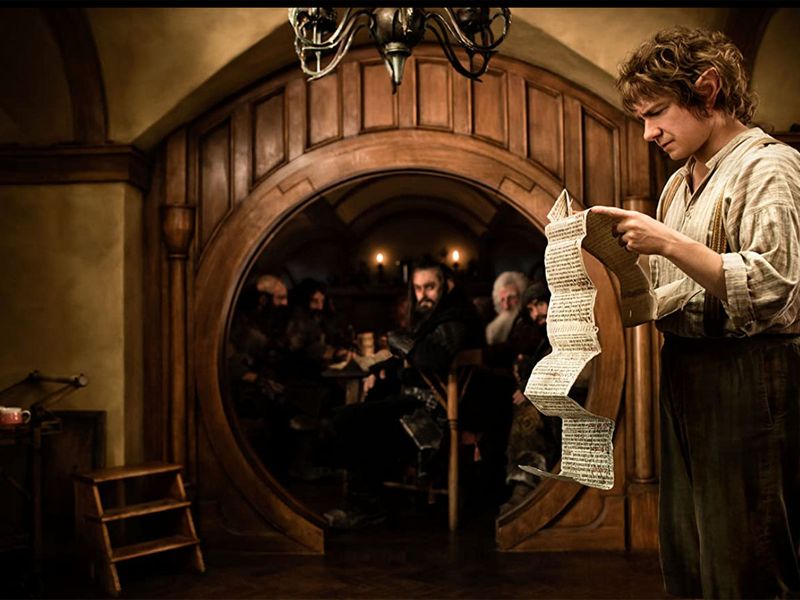
Image Credit: IMDb
“Far over, the misty mountains cold… to dungeons deep and caverns old… ” sings the dwarf king and his clansmen, having arrived to take prim Hobbit, Bilbo Baggins, off on his first adventure (and raid his pantry, but that’s another matter). Except, the rumbling, foreboding song resonates through simply the cutest, coziest little house that you will ever see. Located in Matamata, New Zealand in real life – the underground hobbit hole in the idyllic shire of Hobbiton is the epitome of snugness.
Think round, warm-toned and wood – lots of it. Under a comfy roof of thick, downy grass, the dark green round wooden door is outlined by brick inlay, with intricate wrought-iron work on the back. Enter, and you see an ochre and warm brown world: soft neutral and traditional Iranian style carpets on brown tiles, wooden girders running along the walls, intricate wooden wainscoting on one-half of the warm yellow walls and most heartwarming of all – little round windows in enclaves.
Complementing the decorative woodwork are candelabra, wrought-iron chandeliers, sconces, wicker baskets and plush tufted chairs and sofas. If this sounds like your cup of tea – the Hobbiton set still exists in New Zealand, with the Green Dragon Inn selling traditional Hobbit fare. Mushrooms!
4. The Grand Budapest Hotel
Style: Jugendstil (1930s), Mid-century modern (1968)
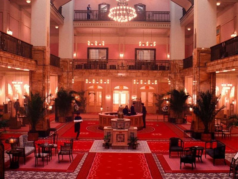
This Grand Budapest Hotel is simply a scrumptious, candy-coloured vista in its 1930s depiction. Production designer, Adam Stockhausen took home the Oscar for this. The design was in the German Jugendstil (Young style) , the German version of Art Noveau, which, according to Oxford dictionary, is a style of decorative art, architecture and design prominent in western Europe and USA, from about 1890. Think early 20th century imperial luxury but modernised. There are three standout sets we focus on – the entrance and lobby, and the hotel room housing the dowager.
Below the towering pastel-pink façade of the hotel, lavender amalgam petals in gold gilding frame the gold entablature entrance. There is a stylised white and gold gilded writing of ‘Hotel’, soft yellow windows, further opulent gold crown molding and cornice, and pink and gold pillars. On entering, the hotel’s iconic lobby is spread with an opulent red and pink geometric carpet with overhead arabesque wooden paneling. The statement piece is the ornate wrought-iron sculpture of lights. Marbled reception counters. Ornate arches dark blue, with gold and white pillars are part of the hilarious shoot out scene.
In the Dowager’s hotel room, white and gold gilded walls with wainscoting, royal Iranian carpets, warm sconces of brass, pink satin curtains and coffered ceilings make for a snug traditional look. The photochroms – vintage colourised images from black and white photographic negatives – feature mountaintop hotels, trains, colonnades and fountains. In a 2014 interview with Architectural Digest, Stockhausen explained, “So much of this film is about Monsieur Gustave’s world being lost and forgotten, and just leafing through the photochroms starts to take you into his world.”
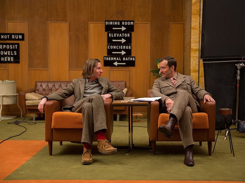
The 1968 version of the hotel screams mid-century modern – with its warm play of earthy brown and ochre, Eames chairs, white ceilings, and sofas with steel tapered legs. Fun fact – our favourite statement piece is the unique antler desk of Deputy Kovac. According to re-thinkingthefuture.com, the Jugendstil was meant to achieve the concept of Gesamtkunstwerk, or a ‘total work of art’, and with Wes Anderson’s meticulously symmetric shots and delicate, satisfying colour palette that won multiple Oscars, I think it’s safe to say that the goal was met. Truly a visual treat.
5. Jodhaa Akbar
Style: Mughal or Indo-Islamic
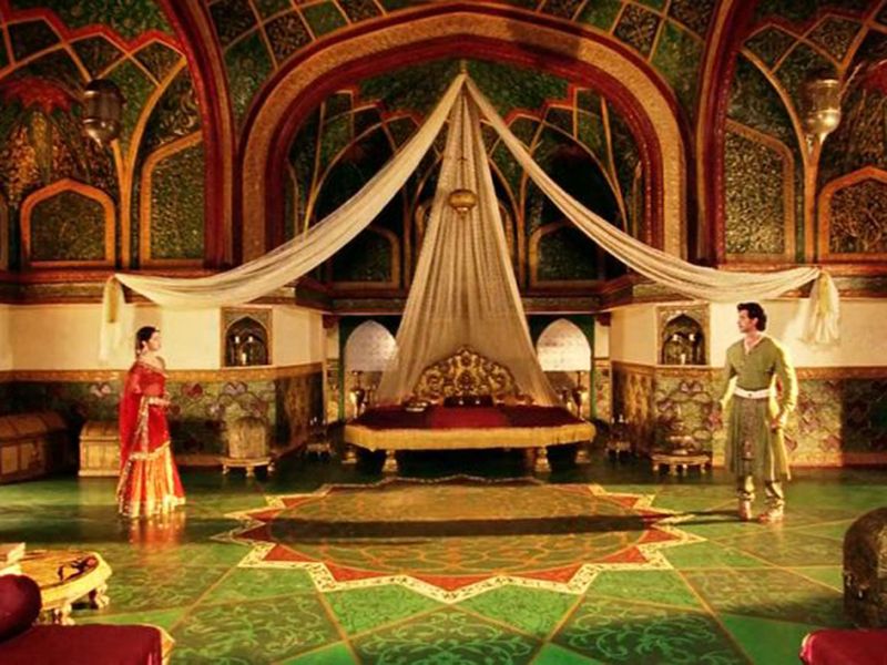
Image Credit: Supplied
The Taj Mahal, the white mausoleum that is an ode to a timeless love and one of the Seven Wonders of the World, sits at the pinnacle of Mughal architecture. The beloved historical fiction film, Jodhaa Akbar (back when it was released, I was taken to watch it twice in theatre because of how much my mum and her friend loved it) centered on the romance between Jalaluddin Mohammed Akbar and Jodhaa shows beautiful examples of Mughal architecture at the time with red sandstone buildings, perforated parapets, chhatris, pointed symmetrical arches, lattice screens and colonnades.
Jodhaa’s chambers feature stunning decorative arches, a dome and panels inlaid using decorative amalgam as well as the technique parchinkari or pietra dura in Italy. This is a technique which involves inlay work of highly polished semi-precious stones like lapis lazuli, jade, agate and jasper. Think about it – when you see patterns in such walls, it’s not drawn on there, but instead coloured gems are shaped into designs and the marble slabs are carved to fit them in exactly so it is perfectly smooth. Jewel tones of red, forest green, and gold are set against sandstone red on the walls, mosaic tile patterns inside and arabesque decoration on the walls. Moreover, of course, the tapestried bed with gold tassels, intricate gold legs, and plenty of tasseled brocade bolster pillows.
Glamping was also on a whole other level back then, as we see in their marriage tents, with gold tassels everywhere, flowing transparent curtains, brocade cushions and Iranian carpets. It is also in royal scarlet, which holds true to Akbar’s decree in the 1600s that only Mughal kings and princes of royal blood be allowed to use tents of scarlet colour (as per a 2017 Issue of the International Journal of Scientific and Research publications by PhD scholar at Aligarh Muslim University). According to indiantents.com, historically, Akbar used to have his court in encampments of hundreds of tents circling the tented palace of Imperial Tent, where he would reside.
6. 2001: A Space Odyssey (Warning, spoilers)
Style: Mid-century modern (space), Neoclassical (end)
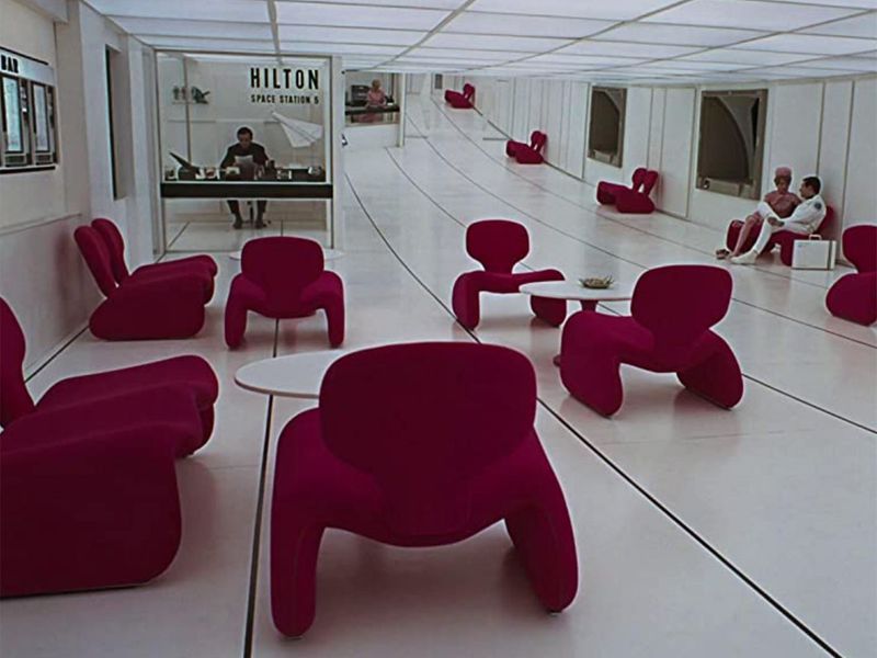
We had to include this – a profound, chilling movie that explores man’s relationship with the universe, 2001: A Space Odyssey’s settings are unforgettable. The space ‘Hilton’ hotel, an idea far ahead of its time, saw pops of bright red in undulating Djinn chairs by designer Oliver Mourgue (still on sale actually) that Kubrick had chosen as a futuristic look, in a glowing white lobby. The conference room houses a U-shaped table with blue classic mid-century modern chairs, both with tapered metal legs.
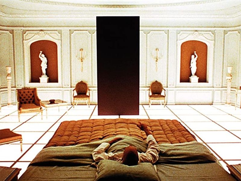
The most eerie of all – the white room at the end where Dr Bowman finds himself after passing through a multi-coloured light tunnel, or the ‘Star gate’ is decorated in a rather out-of-place neoclassical style: with white walls with wainscoting, traditional paintings with gold frames on the walls, intricate consoles, sculptures, baseboard and crown moulding, a tasseled bed with a tufted headboard and button back chairs. However, the unsettling bit is that all of these are underlit by glowing white tiles – the only source of lighting and a jarring contrast to the traditional feel of the room. One would have expected patterned carpets and chandeliers, but from an extraterrestrial point of view… fair enough.
7. Aviator
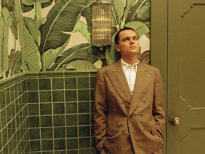
As for this Martin Scorsese film that charts the life of Howard Hughes, the American magnate and polymath, the sets of America’s roaring 20s and beyond stand out bright and dazzling. The standout interior was the Cocoanut grove, a vibrant luxury supper club and a favourite of Hollywood at the time. Situated in LA’s Ambassador Hotel, it featured a lavish Moorish and Moroccan style – with ornate gold ogee arches, bold forest green and vermillion wallpapers, intricate gold pillars, tasseled crimson curtains draped across the room, and full-size palm trees in the hall. Arabesque wallpapers, rather like a decorated chhatri or cupola.
Hughes’s rival and Pan Am Airways founder Juan Trippe’s office is a beautiful Art Deco room, the decorative art style of the 1920s and 1930s, characterised by bold, geometric shapes and strong colours. Another iconic set is the bathroom in bold green leaf wallpaper, which according to filmandfurniture.com is a Martinique banana palm pattern originally designed in 1942 for the Beverly Hills Hotel by Don Loper.
[ad_2]
Source_link